
Deel 1 is nu al een tijdje te lezen in zowel Engels als Nederlands. Nu is deel 2 van ‘Datakaarten in SimCity’ ook beschikbaar in het Engels.
Zodra de Nederlandse versie is melden we dat uiteraard meteen! Voor de volledige afbeeldingen die bij dit bericht hoort kan je op de banner hierboven klikken.
Re-Introduction
Welcome back SimCity fans. Are you ready for Part 2 of the discussion on data maps? Last week I talked about the early versions of SimCity from a fan’s perspective. Now I’m going to talk a bit about how data maps evolved since then. I’m also going to talk about where data maps are headed in the new SimCity.
SimCity 3000
Recall in SimCity 2000, the player had to look at a few different views to see a complete picture of how their fire system worked. This means that when a fire would break out and likely just when the player was panicking, the UI would get in the way. Really, this is when the player should be busy playing the game, strategizing their next move and enjoying the fiction.
Even though SimCity 3000 was a complete re-write, the underlying sprite engine (it was made of two dimensional graphic “cards” tiled on the screen to appear as if in 3D) had many of the same limitations that SimCity 2000 did. As a true sprite-based game it had no ability to overlay graphics. I made some simple improvements for SimCity 3000 that meant fewer steps for the player to see the big picture of what was going on…
The data was improved, if by degrees.
SimCity 4
In SimCity 4, buildings were still sprites but the terrain was rebuilt in 3D. The game actually had both a sprite engine and a 3D engine. This freed up many of the former constraints. As you can see here, data was overlaid using a 3D overlay technique onto the 2D, sprite-based city. Fires, which were now 3D effects, could also draw simultaneously. The result was a system that rendered much more efficiently and was able to combine more elements into the same map view.
By the time we were putting polishing touches on SimCity 4, Andrew Willmott, Ocean Quigley, myself and others found ourselves talking about the next SimCity. We really wanted to take the game in a new direction. We were imagining it could be better. What if the underlying simulation was more dynamic? What if you could see water flowing? It was becoming apparent that the simulation should be more fun to look at.
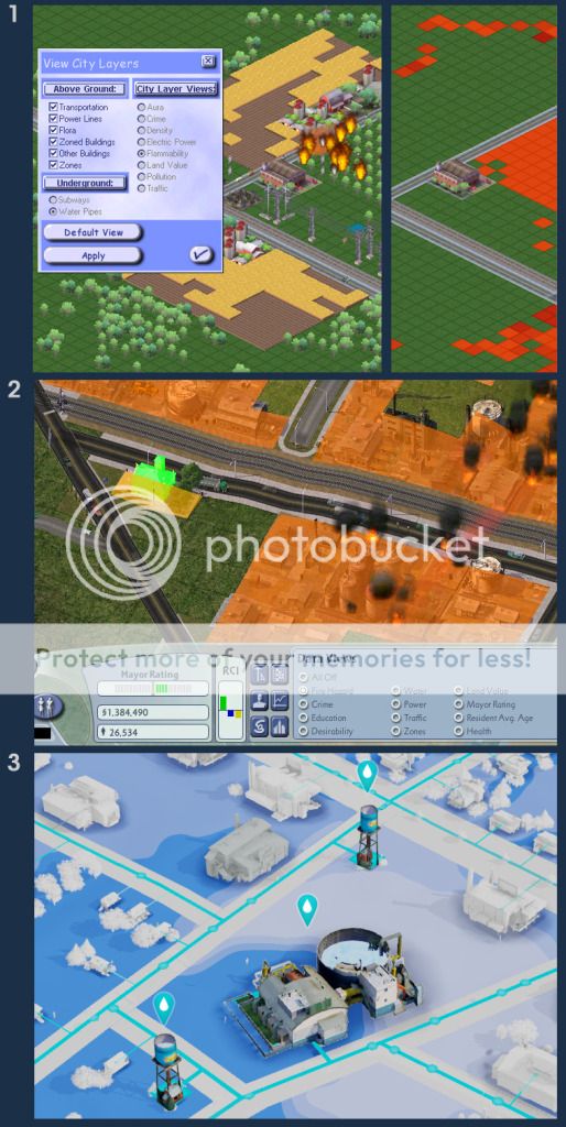
1. A fire in SimCity 3000: On left, the burning farm; on right, we see the flammability map with fire station. 2. “Fire Hazard” map in SimCity 4: Here, showing a Fire station (bright green), Fire Hazard in shades of orange and smoke rising up from an outbreak of a fire disaster. 3. With GlassBox’s sophisticated rendering engine, we are able to show data maps under buildings. Here we see the water table, a water tower and we see the water travelling from the tower to the houses around it.
Agent-based Simulation
Ocean and I made several mockups – little animated vignettes that showed how we could build a game around buildings we called toys. These would be buildings the player would interact directly with to operate the city. We also felt it was time to take the buildings off of the rigid grid. These ideas pointed to an “agent-based” simulation engine. And yet none of us had a clear vision of what that would entail or how we’d get there. So we documented those ideas and then put them aside.
It was much later when Andrew and Ocean were designing a new engine called GlassBox when they had the epiphany that SimCity would be the perfect game to build on top of it. More importantly, GlassBox would enable us to build the kind of SimCity we had imagined so many years prior.
Data in the World Around Us
Looking back, so much has changed since SimCity 4 was released. The public’s perception of data went through an enormous transformation. The way data is presented has been refined and even redefined. We take more care to present it so it’s easier to read and to understand. With so many sophisticated apps available to us, we bring the data closer to the sources it came from. The result is we now use data more often and more effectively.
Data is all over the Internet and it’s on our smart phones. Maps show us traffic congestion. They show us the quickest route from work to home. Joggers can log their miles and calories burned. The list of applications goes on and on.
And in the media, we see movies, TV programs and ads that show us yet more things we can do with it. Movies like Stranger than Fiction or Minority Report set expectations of how data might appear. They clean it up. They romanticize it. They show how it can be used. And by doing so, they package it so the average person understands data’s value and potential.
“Infographics” is a term that is now commonly tossed around on popular websites. Data and art become intertwined to present interesting bits of fact in a context that makes the data palatable, understandable or just better grounded in a larger context.
SimCity Today
And so looking back, the data from our previous games felt static. That’s because the underlying simulation wasn’t that interesting to look at in bare form – at least, not without all the buildings, traffic and disasters sitting on top of it. In contrast, the GlassBox simulator is practically alive. We realized that data layers could do much more than just show a static simulation state in map form. Thinking up a data layer design to ride on top of it has been exciting. Every Sim, car and building is a piece of the simulation and has some autonomy in the larger system. The data layers bring that out and expose the relationships between the different elements.
For example, when the player places a power plant, they will see unpowered roads and transmission lines. Once the power plant is placed, power will start flowing along power conductors to the buildings. If there’s a break in that transmission, the player will immediately see the break. If the power plant isn’t big enough, the player will see the power getting eaten up before it reaches the farther buildings. That information is there in the world to see so the player doesn’t have to look for it – as if they had X-ray goggles that could show electricity flowing. Through the data layers, we’re teaching the player the mechanics of a complex system without them being aware of it. With data layers as a backbone we’re able to take complex simulation-driven information and provide a visual that all players will understand and find accessible.
Since the data layers have become so tightly coupled with the simulation, I wanted to completely re -think how they are organized in the UI. In older games, the data was grouped into one panel almost like an afterthought. By contrast, if you place a fire station in the new game, you will get some unobtrusive fire data that helps you decide where best to place the station. If you need more information, you’ll see a “heavy” data layer with additional fire system information. It’s all feels pretty organic now. So whether fire, water, police or power, the goal is to make data that doesn’t feel like data. When a player looks at the power layer, they will see the electricity flowing. My hope is that instead of thinking “Oh, that’s data,” they should just think, “Cool, I can see my buildings are getting power!”
Thanks for checking back in on Part 2 of data layers. When you get your copy of the game, I hope you have a blast exploring your city creations and I hope the data layers give you the power and knowledge to build your cities just how you imagined them.